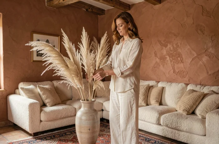
A corduroy sofa facing a raw oak coffee table, all set on a Berber rug with geometric patterns: on paper, each piece is beautiful. In reality, the room feels disjointed because nothing ties these choices together. Creating a harmonious interior starts with connecting the elements, not accumulating one-off impulse buys.
Interior design thread: start with a constraint, not a desire
We often think about decorating in terms of inspiration. We open an app, save images, and buy what we like. The problem arises when we bring everything into the living room: styles clash and colors cancel each other out.
The approach that works in practice is the opposite. Start with an existing constraint in the room: an old terracotta tile floor, an exposed beam, a stone wall, or a cast-iron radiator that cannot be moved. This fixed feature becomes the anchor around which you build the rest.
In practical terms, look at the dominant shade of this feature (the orangey red of the terracotta tiles, the light gray of polished concrete, the warm brown of solid wood) and build your palette from there. Exploring decor inspired by CallMeSpring shows just how much a visual thread can change the way a space feels, even a modest one.
This thread can be a material (wood repeated from the TV stand to the photo frame), a color family (terracotta tones from the floor to the textiles), or a recurring shape (rounded lines echoed from the mirror to the chair back). The idea is not to make everything uniform, but to create visual echoes from one part of the room to another.
Interior design color palette: the rule that helps you avoid missteps
Three colors maximum per room. It’s a simple limit, and one that delivers the most reliable results when you’re new to decorating. Distribute these three colors in specific proportions.
- The dominant color covers most of the visible surfaces (walls, floor, large furniture). It sets the overall mood, often in a neutral or soft shade.
- The secondary color appears in textiles, an occasional piece of furniture, or an accent wall. It adds rhythm without overwhelming the eye.
- The accent color is reserved for decorative objects, cushions, vases, and frames. It adds character and is easy to change with the seasons.
This approach works just as well in a house’s living room as in a small apartment dining room. Changing the accent color is enough to refresh the atmosphere without repainting or replacing furniture.
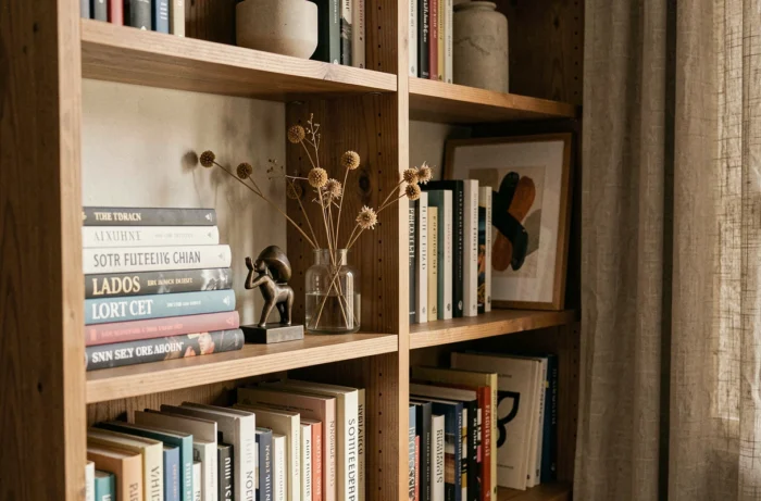
A common pitfall is choosing colors on a screen. Shades vary depending on the room’s natural light. Always test a physical sample against the wall, and look at it in the morning and at the end of the day. A warm color in a north-facing room looks very different from the same color in a south-facing living room.
Mixing materials and furniture: add depth without clutter
An interior made entirely of light wood and beige linen can feel flat, even when every piece of furniture is well chosen. Harmony also comes from carefully balanced contrasts between materials.
A practical rule: combine at least one matte material with one glossy or textured material in each area of the room. Raw wood and black metal. Ceramic and rattan. Velvet and smoked glass. This play of textures adds visual depth without introducing another color.
When it comes to furniture, it’s worth mixing eras rather than buying a complete collection from a single manufacturer. A contemporary designer table works very well with vintage 1960s chairs, as long as there’s a common thread (the same type of wood, color palette, or leg style).
The 2025–2030 sector framework from Ameublement français also highlights repairability and ease of disassembly from the design stage, encouraging people to choose furniture built to last and be rearranged rather than replaced.
Reuse is also a practical way to add character. Reclaimed materials (sanded pallet wood for a shelf, an old shutter turned into a headboard) bring a patina and individuality that no new piece of furniture can replicate. These pieces often become the most talked-about elements in a room.
Lighting and sensory well-being: what traditional decorating tends to overlook
We spend hours choosing the right wall color, then let a bare ceiling light illuminate the room. Lighting is one of the most underused tools in interior design.
In a living room or bedroom, three light sources at different heights can transform the atmosphere. A pendant or ceiling light for general illumination. A table lamp at eye level (on a sideboard or console). Low or indirect lighting (a floor lamp aimed at the wall, a subtle string of lights, or a candle). Layering these sources creates areas of light and shadow that give the space depth.
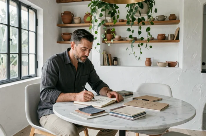
The American Society of Interior Designers’ 2025 Trends Outlook report highlights growing interest in lighting that supports circadian rhythms. In practice, this means choosing bulbs with adjustable color temperature: cool, bright light during working hours and warm, dimmed light in the evening. This sensory dimension, which connects visual comfort and health, goes beyond mere decoration.
Light temperature interacts with the colors you choose. A sage green wall can look grayish under cool light and vibrant under warm light. So always test color and lighting combinations together, not separately.
Decorative objects and clutter: know when to remove rather than add
When a space feels bland, the natural instinct is to add an object. Often, the opposite works better. An interior gains character when every visible object has been chosen deliberately, rather than kept out of habit.
- Group small objects in threes or other odd numbers on a tray or shelf, rather than scattering them across every surface.
- Leave some areas empty: a bare section of wall next to a decorated one gives the eye a place to rest and draws attention to what’s on display.
- Remove one object a week for a month and see whether the room feels clearer. If you don’t miss it, it didn’t belong there.
A harmonious interior is defined by what you’ve removed, not by what you’ve accumulated. Every object you keep should tell a story (a trip, a craft tradition, a specific memory) or serve a clear visual purpose (a material contrast or a touch of accent color).
A harmonious interior doesn’t depend on a budget or a single style. It comes from consistency between choices, from the floor to the light fixture and from the walls to the textiles. Once you have a clear design thread, a restrained palette, and layered lighting, character comes naturally, carried by the few pieces you’ve kept for good reason.